

Incept Asia Logo
Creating logos for Nodesigners. This is not a real company.

Incept is a simple word for “prototype”, “R&D” and “think tank”. According to Merriam-Webster, incept means.
archaic : BEGIN, COMMENCE, UNDERTAKE
It’s also a very good movie “Inception”.
The first thing I do is do a google image search for ideas on how other designers interpret the name.
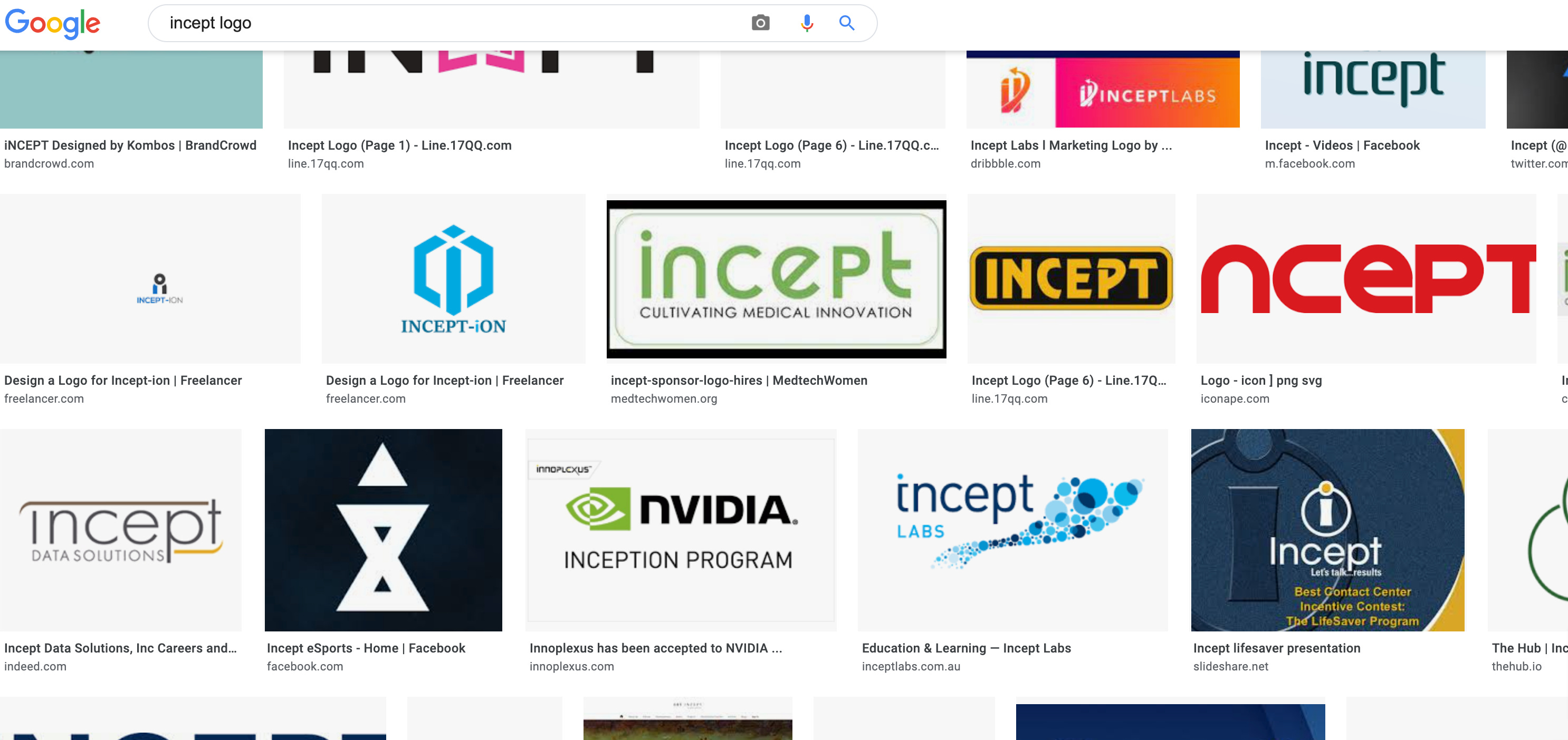
In the image above, I liked the blue circles and immediately thought about the movie. Specifically the part where the mind has many thoughts, one can imagine these as circles. So I came up with a simple concept.

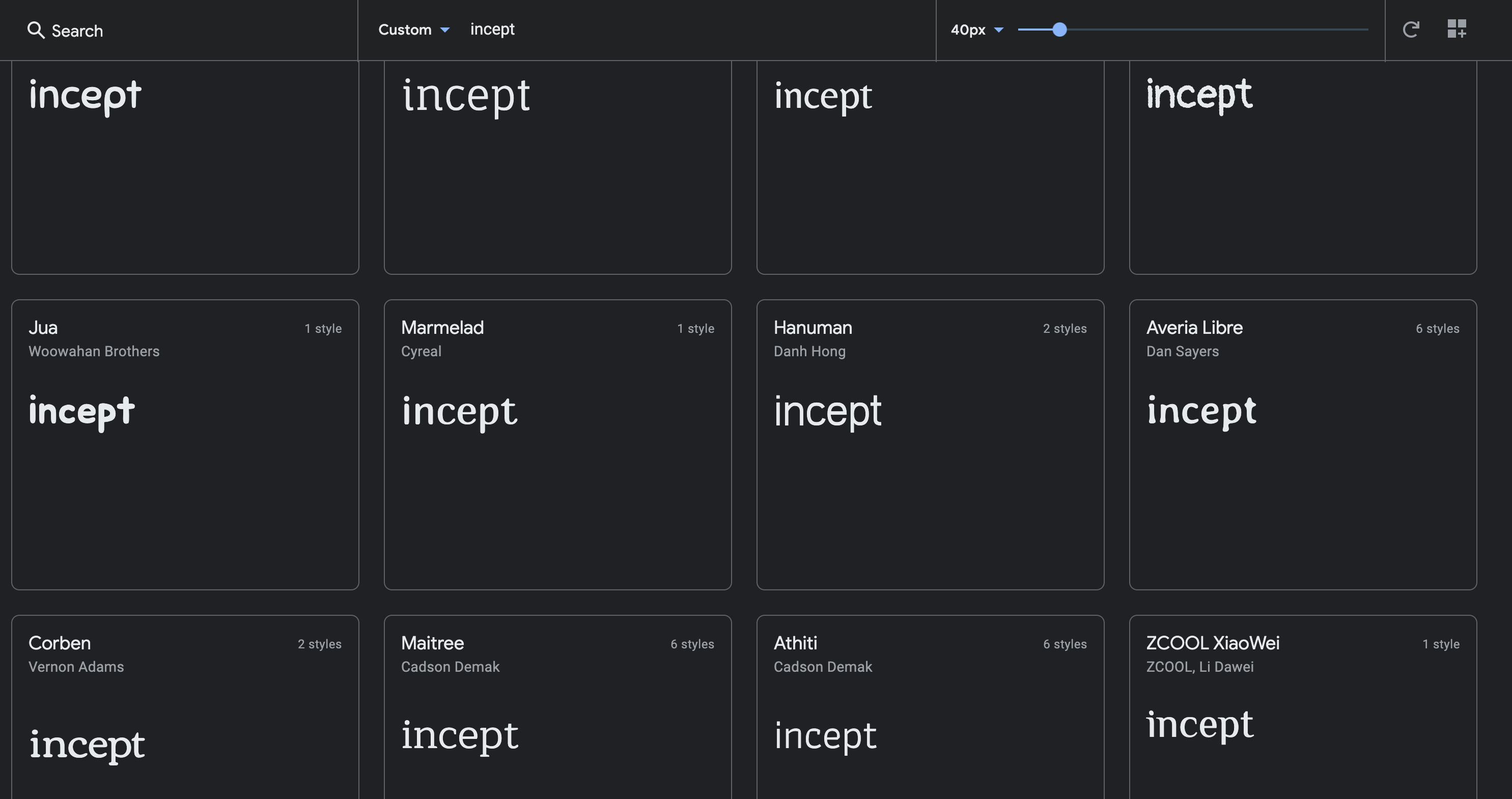
So anyone should know how to draw circles in an editor. The font was chosen by going to Google Fonts and typing in the keyword. It’s easier doing it this way so you can quickly review fonts by simply scrolling down till you find the right one, then download the font freely.
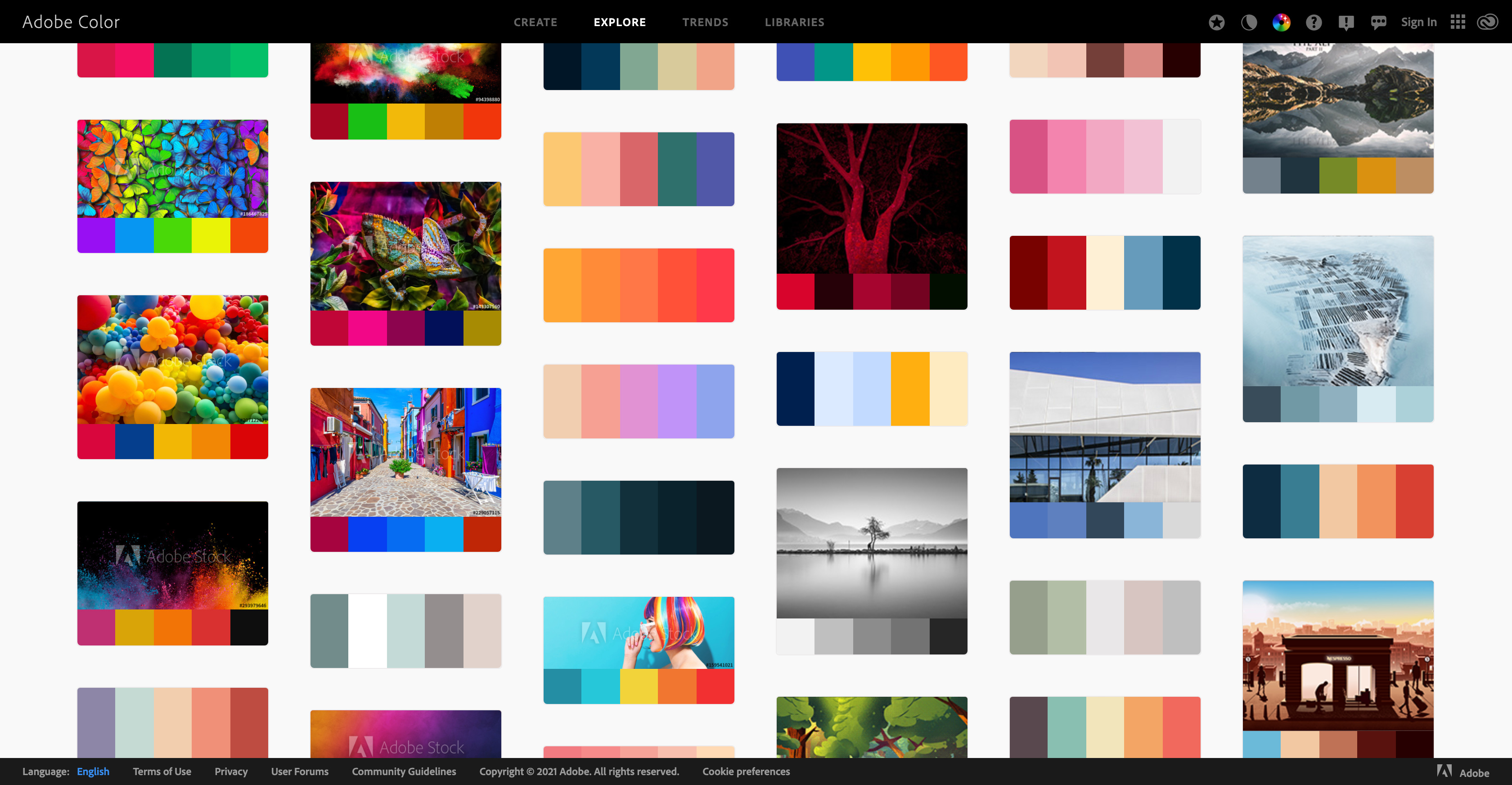
The colors were chosen by going to Adobe Colors. Color combinations here have been vetted by a professional creative community managed by Adobe. If you are not a creative person, it’s better to trust the experts. You can extract the color codes by simply clicking the stencils you like.
After a few hours of trial and error, I came up with a round 2 of logo sets like the following. When creating a logo we need to think about application. For example, how would this logo look like on a business card, letterhead, a shirt and a mug.

Lastly when designing your logos you want to be able to explain the meaning. As mentioned before, the mind has many thoughts, one can imagine these as the blue circles. In the movie they changed just one thought and that one thought changed the world, the pink circle. The font itself cleverly starts and ends with the same thought. When thinking about your logo, here are some key points to consider.
Companies that IPO have simplistic logos between 1 to 3 colors and generally can be recreated easily.
The graphics should use simple shapes
The logo should have both an easy and deep meaning
Think about the logo’s application on different materials
Remember you can always change it